|
* TinkerDifferent *
Retro Computing Community |
| Home | Forums | What's New | Search | Settings |
| Rhapsody User Experience Preliminary Design Document v0.8 |
Forums > Vintage Apple > Software & Operating Systems > Software | Mac OS (PowerPC)
|
Fizzbinn Active Tinkerer Charlottesville, VA -------- Joined: Nov 29, 2021 Posts: 256 Likes: 262 |
Apr 23, 2025 - #1
I'm wondering how widely known this doc is? I was doing some organizing of old boxes (trying to downsize my "collection") and I stumbled across a printed copy of this leaked? doc, I believe I got it somewhere off the Internet in the late 90s, at the time (I was in college, a Mac-head when everyone else thought Apple was going to be gone soon) I think recall being excited for what Rhapsody would be and thought it was very cool to see how folks inside Apple were thinking about it. By the time Mac OS X was actually released it was so very different... which I recall being somewhat annoyed at but willing to give a chance. In the early days of Mac OS X a lot of the interface seemed different for no reason to me and I'm not talking about the Aqua theme/colors. At least its wasn't as bad as the Developer preview which I believe had no Apple menu, but and Apple icon in the center of the menu bar.
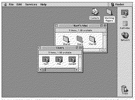
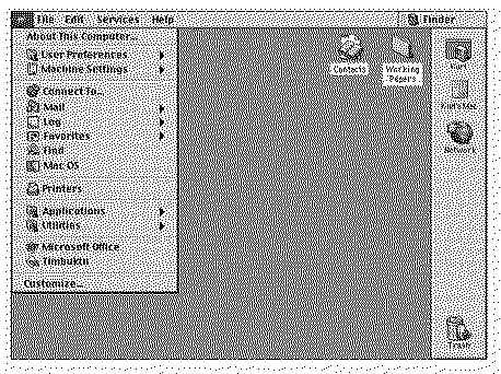
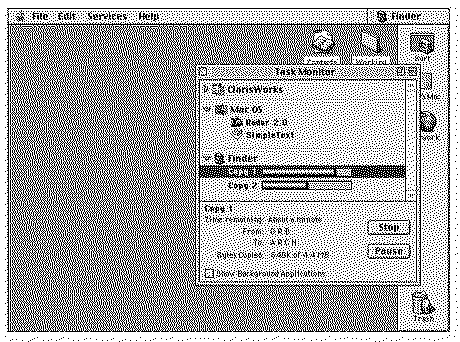
This doc's creators propose an OS that while NeXT under the covers has a stated goal of being much closer to an evolved "Mac OS 8" interface wise. Interesting to think about the path not taken.
Liked by jeffburg,ClassicHasClassanderic |
|
misterg33 New Tinkerer -------- Joined: Oct 10, 2022 Posts: 61 Likes: 14 |
Apr 23, 2025 - #2
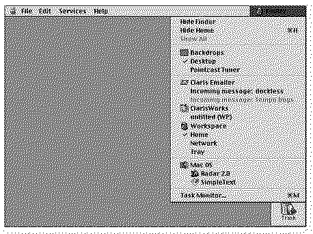
That dock on the right looks familiar. I believe this was something that was worked on for Copland at one point. There was even a third party shareware implementation you could download (though I can't remember the name of it).
|
|
Fizzbinn Active Tinkerer Charlottesville, VA -------- Joined: Nov 29, 2021 Posts: 256 Likes: 262 |
Apr 24, 2025 - #3
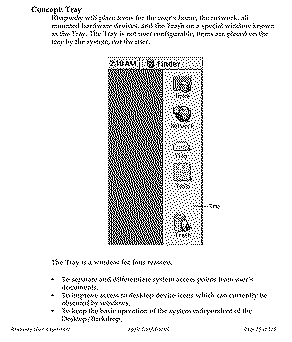
In this Design Document its called the "Tray":
Certainly a concept they eventually abandoned.
|
|
ClassicHasClass Tinkerer -------- Joined: Aug 30, 2022 Posts: 386 Likes: 215 |
Apr 24, 2025 - #4
I could totally have seen myself using this. Heck, I actually do like working in Rhapsody. The only thing I don't like about it is the slightly different Charcoal font which falls in the typeface uncanny valley.
Liked by Fizzbinnandmisterg33 |
|
misterg33 New Tinkerer -------- Joined: Oct 10, 2022 Posts: 61 Likes: 14 |
Apr 26, 2025 - #5
That was a really fascinating document. Thank you so much for sharing it. You can tell that the people that worked on this really cared about the user experience. I am thankful that yellow and blue ended up sharing the same finder. And that blue did not end up running in a window.
Liked by Fizzbinn |
| Page 1 of 1 |
| Home | Forums | What's New | Search | Bookmarks | RSS | Original | Settings |
| XenForo Retro Proxy by TinkerDifferent.com |