|
* TinkerDifferent *
Retro Computing Community |
| Home | Forums | What's New | Search | Settings |
| Dark mode vs. Light mode |
Forums > Forum Announcements, Guidelines & Feedback > Feedback
|
fehervaria Tinkerer North Germany -------- Joined: Sep 23, 2021 Posts: 160 Likes: 171 |
Sep 24, 2021 - #1
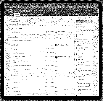
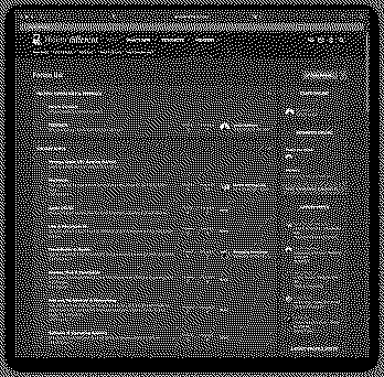
I like very much the features and the design of the "Dark mode" but my eyes getting extremely tired reading bright text on dark background.
Would it be possible to have exactly the same look-and-feel in Light mode than in the Dark mode? I attached two screen-shots to make it easier to compare.
|
|
Kai Robinson TinkerDifferent Board President 2023 Worthing, UK -------- Joined: Sep 2, 2021 Posts: 1,322 Likes: 1,313 |
Sep 25, 2021 - #2
@Branchus would be best to answer this one!
|
|
JDW Administrator Japan -------- Joined: Sep 2, 2021 Posts: 2,534 Likes: 1,981 |
Sep 25, 2021 - #3
Hi, Attila.
Thanks for your feedback. I actually made the Blue colors darker before we invited Beta testers here. The default Blue was just too bright. I did not touch the default "White" color of the text, however. The reason is because the background is not 100% black. It's a dark gray. My concern is that if we make the text a light gray, it may be difficult to read for older people who require higher contrast. When i use Dark Mode for a while and then switch the Light Mode, I am blinded by all the white! :) Of course, if you are viewing Dark Mode in a dark room with no lights on, then I can see how the text would be very bright. But is that your use case? Please let me know your thoughts in light of this. |
|
alex_santos New Tinkerer -------- Joined: Sep 25, 2021 Posts: 42 Likes: 23 |
Sep 25, 2021 - #4
I sort of prefer the white mode. Maybe a happier path might be a light grey? Can a third mode be created on the backend?
|
|
fehervaria Tinkerer North Germany -------- Joined: Sep 23, 2021 Posts: 160 Likes: 171 |
Sep 25, 2021 - #5
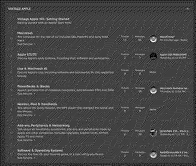
Not exactly. In general the design (colours, fonts, icons, etc) are looking very good in the Dark mode. What I would like to point, about the 'Dark mode vs Light mode' is to use "exactly" the same design language but - let me make simple my explanation - the light mode is: bright background dark text, and the dark mode is: dark background with bright text. How dark is the dark in dark mode and how bright is the text - that is GUI designer job. Some on light mode. For many of us is easier to read (long minutes/hours) dark text on bright background. If you look to my screenshots and switch between them quickly, you will see the "design difference" - not only the dark background/bright background. In one sentence: the light mode is not the dark version of the dark mode. They are two "totally different designs" :) I like the design of the "dark mode" JUST it should be bright: light background with dark text. But if it is a real "big" work now then it can wait, we can live with that, as it is in this moment. Later, when we will have graphic designer members already "maybe" one of them should do a homogeneous design in two version: light and dark. :) Liked by JDW |
|
JDW Administrator Japan -------- Joined: Sep 2, 2021 Posts: 2,534 Likes: 1,981 |
Sep 26, 2021 - #6
So basically you want a white-background version of our Dark theme. The situation is that the Light theme is actually the default XenForo theme that we only slightly modified. We had to pay some money to buy the Dark theme. So basically money solves all problems! We need to get some more people to talk about this point. That way we can better understand what most forum members like and dislike. Liked by fehervaria |
|
Branchus Administrator -------- Joined: Sep 2, 2021 Posts: 237 Likes: 518 |
Sep 29, 2021 - #7
Liked by Androda,fehervariaandJDW |
|
JDW Administrator Japan -------- Joined: Sep 2, 2021 Posts: 2,534 Likes: 1,981 |
Sep 29, 2021 - #8
|
|
fehervaria Tinkerer North Germany -------- Joined: Sep 23, 2021 Posts: 160 Likes: 171 |
Sep 29, 2021 - #9
Yes. it is much better now. Let's hope the other will like it too.
Thank you Bruce, @Branchus. Liked by BranchusandJDW |
|
trag Tinkerer -------- Joined: Oct 25, 2021 Posts: 303 Likes: 151 |
Oct 25, 2021 - #10
I do not like the dark mode at all. I find it extremely difficult to read. But then, I'm 58-years-old. Nothing wrong with my eyes AFAIK, but I'm older.
If dark mode was all that was available, I would give up on trying to read the site. I mention this, because it wasn't until I looked for somewhere to comment about how unreadable everything was, that I found mention of dark and light mode. Being able to change in preferences is great. But, how many users might you lose because your introduction is eye-straining and they don't realize it can be changed? |
|
fehervaria Tinkerer North Germany -------- Joined: Sep 23, 2021 Posts: 160 Likes: 171 |
Oct 25, 2021 - #11
@trag Thank you for telling. My original post was about the equality of the bright and the dark mode.
Then, I got to know, the two design is completely different (the bright design is the default from the forum, the dark design is payed and fine tuned). It would be great if the dark design features, functional and visual, would be available in the bright design. But it is not the case. If we want to use the bright design, we have to use the default from the forum engine, otherwise the fancy is only dark. |
|
JDW Administrator Japan -------- Joined: Sep 2, 2021 Posts: 2,534 Likes: 1,981 |
Oct 25, 2021 - #12
For now, what would you propose to make it easier to find at the top forum page? |
|
Branchus Administrator -------- Joined: Sep 2, 2021 Posts: 237 Likes: 518 |
Oct 25, 2021 - #13
This theme is an off-the-shelf template design, which is only available in a dark version, so we can't just make a light version of it (not simply anyhow). While I agree that dark mode viewing is not as clear, the majority consensus was for the dark theme, which is why it is the default.
If there are any specific features you want added to the light theme (which is the default theme that comes with XenForo), we'll do what we can, but simply inverting this theme isn't really an option, I'm afraid. In the future, we may well look into more available themes for members to use, but each one we deploy comes at a financial and time cost. If it makes you feel any better, I've had similar discussions about light themes with people who prefer dark. We'll never be able to please everyone. Liked by fehervariaandJDW |
|
JDW Administrator Japan -------- Joined: Sep 2, 2021 Posts: 2,534 Likes: 1,981 |
Oct 25, 2021 - #14
|
|
trag Tinkerer -------- Joined: Oct 25, 2021 Posts: 303 Likes: 151 |
Oct 25, 2021 - #15
I don't know. I wish I had a great solution. My personal desire would be to default to light mode, but it seems like a lot of folks like dark mode more. So then you have the same problem, just in reverse. A giant welcoming banner that says, "Hey, if you don't like the look, change it in preferences." ?? |
|
Kai Robinson TinkerDifferent Board President 2023 Worthing, UK -------- Joined: Sep 2, 2021 Posts: 1,322 Likes: 1,313 |
Oct 25, 2021 - #16
A banner is definitely easy to implement, and an excellent suggestion!
Liked by JDW |
|
Elemenoh Active Tinkerer Bay Area -------- Joined: Oct 18, 2021 Posts: 428 Likes: 415 |
Oct 25, 2021 - #17
@Branchus I noticed the light theme doesn't have a forum collapsing widget like dark mode does. Can you add that in?
|
|
Branchus Administrator -------- Joined: Sep 2, 2021 Posts: 237 Likes: 518 |
Oct 25, 2021 - #18
|
|
Kai Robinson TinkerDifferent Board President 2023 Worthing, UK -------- Joined: Sep 2, 2021 Posts: 1,322 Likes: 1,313 |
Oct 26, 2021 - #19
@Branchus , can we make the font consistent across themes?
|
|
Branchus Administrator -------- Joined: Sep 2, 2021 Posts: 237 Likes: 518 |
Oct 26, 2021 - #20
That shouldn't be too difficult. Which font do you prefer? Dark mode is Google font PT Sans Caption, light mode is Segoe (for the Windoze folks) or Helvetica Neue for the Mac folks.
|
| Page 1 of 2 | Next > | Last >> |
| Home | Forums | What's New | Search | Bookmarks | RSS | Original | Settings |
| XenForo Retro Proxy by TinkerDifferent.com |